
Last week I made a post about free admission not being enough to garner attendance at museums and that programming appropriately for target audiences also being necessary.
The very next day, Colleen Dilenschneider and IMPACTS Experience released data arguing against discounting admission. They have shared data on this topic before, but this is some of their best work yet. A subscription is required if you want to read it, but it is worth it if you are having conversations about this in your organization and want some hard data to back it up.
They address the fact that discounting seems good and effective because it responds to a need. However, it is trading long term success for short term results.
One of the biggest issues is that discounting appears to impact satisfaction with the experience. The bigger the discount, the less satisfaction people experience.
In Q2 2026, visitors who paid full price reported an overall satisfaction score of 73.7. Visitors who reported receiving a 1-19% discount had a satisfaction score of 72.3. At a 20-39% discount, satisfaction was 70.0. At a 40-59% discount, it was 69.2. At a 60-99% discount, it was 68.5. Visitors who received 100% free admission reported satisfaction of 68.4.
In both Q2 2017 and Q2 2026, satisfaction generally decreases as the depth of discount increases. In 2017, full-price visitors reported satisfaction of 73.9, while visitors receiving free admission reported 68.0. In 2026, full-price visitors reported satisfaction of 73.7, while free-admission visitors reported 68.4.
Note that in the course of 10 years, there is a variation of .3-.4 points.
The same holds true in terms of willingness to recommend the experience to friends–something that is far more powerful than any advertising an organization can mobilize. The bigger a discount, the less likely people are to recommend it to friends.
In 2026 full price visitors had a baseline score of 73.9 when it came to likely to recommend and fully free visitors had a score of 65. In 2017 this was 74.5 and 65.4.
Despite the social, political, and economic environment changing a fair bit in 10 years, the behavior has barely budged.
Note, these numbers aren’t percentages, they are scalar variables where a difference of 1 point is statically significant. An 8-9 point gap between full price and free admission visitors is meaningful.
So you may appreciate when it comes to intent to revisit, a 33.2 point difference between full price and free admission visitors is pretty mind blowing.
In Q2 2026, full-price visitors reported a revisit intent score of 64.2. Visitors who received a 1-19% discount reported 52.1. Visitors who received a 20-39% discount reported 44.8. At a 40-59% discount, revisit intent was 40.2. At a 60-99% discount, it was 37.1. For free admission, it was 31.0.
That is a 33.2-point difference between full-price visitors and free-admission visitors. This is not a small gap. It is a major strategic signal.
Again, the difference between Q2 2026 and Q2 2017 is a few tenths of a point.
One of the things they emphasize is that discounting is not the same as affordable access.
Affordable access is mission-driven. It is rooted in equity, public service, and the recognition that cultural organizations exist to serve communities, not merely to sell admissions. It asks, “What barriers prevent certain people from participating in the cultural life of this organization, and how can we responsibly reduce those barriers for the people most affected by them?”
Dilenschneider emphasizes that affordable access programs are very intentional, targeted, and mission-connected and shouldn’t be lumped together with board promotional discounting.
She notes there are appropriate times to discount like shifting attendance to lower demand time, when trying to measure interest in a newly rolled out program, or trying to reactivate lapsed attendees for whom price has been a barrier.
Near the end they list what executive leaders should do in relation to price with some explanations. I am only including the header here for brevity. I felt like this section, along with all the data and insights they offered is what made this post so valuable for the busy arts leader who may be thinking, how do I move forward knowing all this.
First, diagnose the actual barrier
Second, protect the organization’s value signal
Third, measure the right outcomes
Fourth, separate affordable access from promotional discounting
Fifth, remember that the long game matters
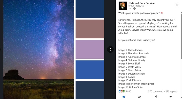
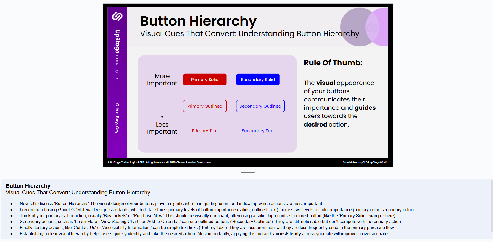


Yes, we have been undergoing a review of websites to make sure there are good contrasting colors for people. Since…