Last week Drew McManus posted a slidedeck he used for a presentation at the Chorus America conference on LinkedIn. I wasn’t at the conference, but I have previously attended conferences at which he did his Click. Click. Done. presentation on using Google Analytics. So I have been a fan of his conference presentations for awhile.
The one he did at Choral America followed his naming theme, Ciick, Buy, Cry. This one was on the topic of web design and how some elements can be a deterrent to a customer’s purchase experience.
The slidedeck he made available as all the presenter notes and talks about different aspects of a user experience from how people scan a webpage, how mobile first design prioritizes how people increasingly interact with webpages, and the importance of repeating your primary links if people have to scroll more than two page lengths to view all parts of your site so that they aren’t forced to scroll back up later.
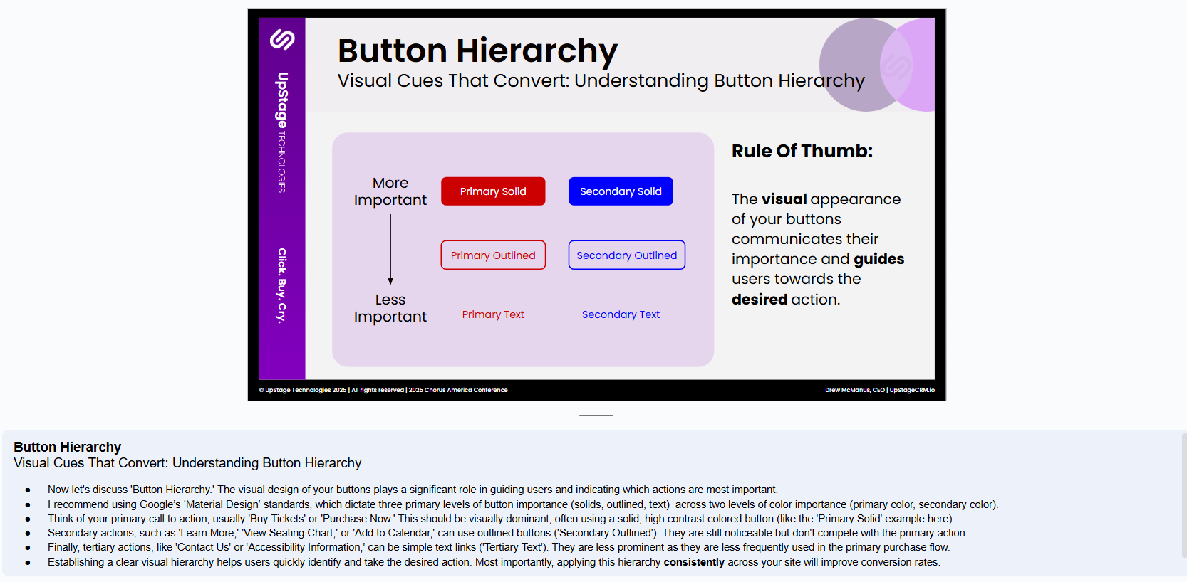
The part that really caught my attention was the visual hierarchy of buttons: A solid button indicates more important role than an outlined button which indicates a more important role than just text.
I have included that specific slide and Drew’s notes below. If this piques your interest at all, check out the full slidedeck and notes.