I just finished teaching a public speaking course this semester. One of the pieces of advice I tried to emphasize for my students was not to fill your Powerpoint slides with tons of text.
It was difficult to accomplish this goal. I must confess part of me was secretly pleased that members of the visually oriented Millennial generation were having the same struggles with simplifying their presentations as those who pioneered the use of Powerpoint.
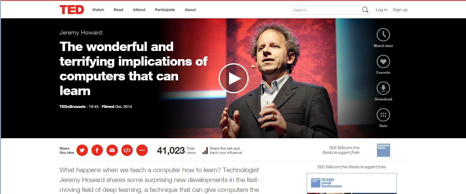
This being said, the minimal look is definitely in.
Drew McManus has been advocating for flat and responsive web design for awhile. You can also see the increased use of a page spanning dominant image on sites like TED.com
and the Weather Channel

The SlideShare blog recently featured slide decks that Guy Kawasaki promotes for aspiring entrepreneurs that translates this minimalist approach to slide decks. The first has a lot of great examples of text heavy slides that were heavily trimmed down and had a single central concept set against a single dominant image. (requires Flash)
[slideshare id=295996&doc=sample-slides-by-garr-reynolds-1204852162670051-5]
Slide number 5 provides a good example of how to transition from what might be your current practice to a more minimalist approach, taking an image of President Kennedy from the corner and making the slide all about the image and his “Ask not…” quote. Many of the other slides are an example of an entirely revamped approach to a topic.
The other slide deck that caught my eye was the third. It provides a template to help a marketer create a presentation about different customer personas. It is created as something your organization or company can use immediately to present what you know about the different demographics that comprise your customer.
When I immediately, I mean it is pretty much designed so you can download it right now, delete the instructional and example slides, plug in the relevant data and images and use what remains as a basis for a presentation if you want. (requires Flash)
[slideshare id=30601327&doc=buyerpersonatemplate1-140129195502-phpapp01]
1 thought on “Info You Can Use: Minimalist Design and Slide Decks”